Design and build notes
Foreland Marine
How an independent superyacht consultancy was given an identity that never appears on a white page, and a site that carries four services, six tools and a paid subscription product.
- Client
- Foreland Marine
- Sector
- Superyacht consultancy
- Year
- 2026
- Scope
- Brand identity kit, Website design, Development, Copy direction, Payments and membership infrastructure
The commission
Foreland Marine is an independent consultancy working on sailing and motor yachts between 24 and 60 metres. It runs refit projects, acts as owner's representative on new builds, manages yachts in service and takes technical consultancy work. Its commercial position is that it holds no yard affiliations, takes no broker commissions and accepts no referral fees, so its advice carries no conflict of interest.
That independence is the product. The brief was to build an identity and a site that make it legible without saying it too loudly, and that read like a colleague rather than a brochure.
Yacht consultancy sites converge on a single look: a dark page, drone footage, a carousel of superlatives and a contact form. The convergence is so complete that a reader cannot tell two firms apart. Foreland's advantage is editorial, in that it thinks clearly and writes plainly, so the work was to make the identity and the site behave the way the consultancy behaves.
What was delivered
- Brand identity kitVersion 1.0, April 2026, covering mark, colour, type, iconography, components, motion, photography and voice
- The websiteCustom build, no template, no marketing pixels
- A paid subscription productTechnical Support, with Stripe checkout, webhooks and invoicing
- Six self-serve toolsBuilt as part of the site rather than bolted on
- A gated membership areaForeland Group, entered by invitation code
- The editorial systemLater became the foundation for The First Owner's Reference
- 30 March 2026First commitThe site begins, with the membership marks in the footer from the first day
- April 2026Brand identity kit, version 1.0Mark, colour, type, components, motion, photography and voice, written down
- 18 June 2026Performance and search passCanonical leak fixed, homepage and journal server-rendered, images compressed
- 24 July 2026Operations backend addedCRM and finance at /admin, plus a general payment page
- 4 August 2026Structured data and llms.txtReal sitemap lastmod, entity sameAs, speakable markup, and the AI-typical interface chrome stripped out
- 18 August 2026Latest commitA copy and grammar pass across the site
- Commits
- 210
- First to latest
- 20 weeks
- Pages
- 65
- Kit version
- 1.0
Dates taken from the project's commit history, with the kit version and date from the brand document itself.
The mark
The company takes its name from the South Foreland Lighthouse in Kent, which has guided vessels into the Thames Estuary since the seventeenth century and later carried the first ship to shore wireless transmission. The mark is that lighthouse, drawn with its signal beam, and the wordmark sits beside it.
The single most consequential decision in the identity is negative: the kit contains no light colourway at all. The mark exists in white and is placed on navy, and there is no approved alternative. That removes an entire class of inconsistency, because there is no decision to make about which version to use, and it puts clear distance between Foreland and competitors still trading on white pages.


The lockup on its 850 by 145 unit artboard, ruled at the width of the lighthouse. The drawn ink measures 810 by 129.36 units, so the whole lockup is 10.44 lighthouse widths across. The wordmark is set as outlines rather than live text, which means the file is a single path and cannot lose its typeface when it travels.
- Aspect ratio
- 6.26 : 1
- Measured from the drawn path
- Construction module
- 77.62 units
- The width of the lighthouse
- Artboard
- 850 × 145
- viewBox units
- Drawn ink
- 810 × 129.36
- Lighthouse
- 77.62 × 129.36
- 0.600 : 1, full lockup height
- Mark to wordmark
- 48.67 units
- 0.63 of the lighthouse width
- Wordmark
- 683.71 units
- 8.81 lighthouse widths
- Subpaths
- 38
- One path, no live text
Three relationships hold the lockup together. The brand document forbids altering any of them.
- 1The lighthouse. 77.62 units wide against a 129.36 unit height, a ratio of 0.600 to 1. The standalone icon measures 0.6001 to 1, which confirms the two are the same drawing rather than two versions of it.
- 2The separation. 48.67 units of air between the mark and the first letter, which is 0.63 of the lighthouse width. This gap is the measurement most likely to be nudged in a hurry, and the one the kit specifically protects.
- 3The wordmark. 683.71 units, or 8.81 lighthouse widths, on a cap height of 68.9 units. It is drawn, not typeset, so it renders identically wherever it is placed.
Clear space is a margin equal to the height of the lighthouse on all four sides. Because the lighthouse runs the full height of the lockup, the rule resolves neatly: the exclusion zone is one lockup height deep on every edge, which is easy to judge by eye and hard to get wrong.
x = the height of the lighthouse, 129.36 units on the artboard.
96px140px204px300px420pxThe lockup has a hard floor of 204 pixels on screen and 50 millimetres in print. Below that the wordmark closes up and the lighthouse loses its beam, so the standalone icon takes over instead. The floor is unusually high for a logo, which is a consequence of the wordmark being long and the mark being narrow.
Documented floor: 204px on screen, 50mm in print. Anything below is shown greyed.
Four of the five documented restrictions are shown. The fifth, that the lockup is never used below 204 pixels or 50 millimetres, is covered by the size ladder above.
Colour
The palette is four blues and white. Three of them are grounds, running from the deepest navy in the footer up through the page background to the chart blue used for cards and raised surfaces, so depth is built from the palette rather than from shadows. Ocean is the only accent and is reserved for interactive elements.
The rule that does most of the work is that body copy is set in muted blue rather than grey or white. White is held back for headings and emphasis. Because text and background are drawn from the same family of colour, the pages hold together even where the density of information is high.
Deep navy
#040D1A
4, 13, 26
Deepest backgrounds and the footer
Navy
#081630
8, 22, 48
Primary page background
Chart blue
#0C1E42
12, 30, 66
Cards and elevated surfaces
Ocean
#5386B6
83, 134, 182
Buttons, links, accent bars
Muted blue
#7BA8C8
123, 168, 200
Body copy, descriptions, secondary text
White
#FFFFFF
255, 255, 255
Headings and emphasis only
Green
#22C55E
34, 197, 94
Success states and positive indicators
Measured contrast
| Pair | Sample | Ratio | WCAG 2.1 |
|---|---|---|---|
| White on navy | Sample text | 18.0:1 | AAA |
| Muted blue on navy | Sample text | 7.1:1 | AAA |
| Muted blue on chart blue | Sample text | 6.5:1 | AA |
| Ocean on navy | Sample text | 4.7:1 | AA |
| White on ocean | Sample text | 3.9:1 | AA large |
Ratios are computed from the hex values on this page under WCAG 2.1, not quoted from the brand document.
Depth beyond the three grounds comes from white at fixed opacities rather than from new colours. Five values are defined and nothing outside them is used, which is why borders and dividers stay consistent across sixty-five pages.
The opacity system
- Hover backgrounds
- white 5%
- Subtle borders and dividers
- white 8%
- Card borders, section dividers
- white 10%
- Active borders, outline buttons
- white 20%
- Prominent borders
- white 30%
Colour rules
- Light page backgrounds
- Never
- Accent share of a layout
- Sparing
- Body text colour
- Muted blue
- Saturated colour outside the palette
- Never
Typography
One typeface does all of the work. Nunito Sans is a humanist sans with a warm character, and the brand uses four of its weights for four fixed jobs. The distinctive choice is that headings are always set at the light 300 weight, large and unemphasised. Most consultancies reach for bold headings to signal authority; setting them light says the opposite, and says it consistently.
Nunito Sans
The whole site, one family
"Nunito Sans", "Aptos", system-ui, sans-serif
Light 300 for all page headings, regular 400 for body, semibold 600 for buttons, labels and section markers, bold 700 reserved for rare strong emphasis. There is no second typeface anywhere in the system.
ABCDEFGHIJKLMNOPQRSTUVWXYZ
abcdefghijklmnopqrstuvwxyz
0123456789 & £ € , . ; : ( ) “ ”
Independent. No yard affiliations, no broker commissions, no referral fees.
| Size | Role | Family | Weight | Line height | Tracking | Set |
|---|---|---|---|---|---|---|
| text-3xl to 5xl | H1, responsive | Nunito Sans | 300 | — | normal | Aa |
| text-2xl to 3xl | H2, responsive | Nunito Sans | 300 | — | normal | Aa |
| text-base | H3 | Nunito Sans | 600 | — | normal | Aa |
| text-sm to base | Body | Nunito Sans | 400 | relaxed | — | Aa |
| text-xs | Section label | Nunito Sans | 600 | — | 0.15em | Aa |
| text-sm | Button | Nunito Sans | 600 | — | normal | Aa |
| text-xs | Caption | Nunito Sans | 400 | — | normal | Aa |
- •Page headings are never bold. This is the most distinctive typographic rule in the brand and the one most likely to be broken by a hand that is not familiar with it.
- •Section labels are uppercase, semibold, tracked to 0.15em, set in ocean, with 12 pixels beneath them.
- •Body text never runs larger than text-base, however much space is available.
Interface
The component set is small and fully specified, which is what allows a site of this size to be extended without a design review each time. Every value below is fixed in the brand document rather than decided per page.
Primary button
- Background
- #5386B6
- Text
- White, semibold, text-sm
- Padding
- 24px × 12px
- Corner radius
- 4px
- Hover
- Accent at 90%
- Transition
- 150ms, colours
Outline button
- Border
- White 30%
- Text
- White, semibold, text-sm
- Padding
- 24px × 12px
- Corner radius
- 4px
- Hover
- White 10% fill
- Transition
- 150ms, colours
Service card
- Background
- #0C1E42
- Border
- White 8%
- Left accent bar
- 4px, ocean at 70%
- Padding
- 32px, 36px left
- Hover border
- Ocean at 30%
Header
- Behaviour
- Sticky
- Height
- 80px
- Background
- #081630 at 95%, blurred
- Bottom border
- White 8%
- Mobile
- Full-screen overlay, scroll locked
The brand document specifies components in detail and says nothing about layout. In practice the site settled on a consistent set of widths and rhythms anyway, and they are worth recording, because an undocumented convention followed sixty-five times is a system whether or not anyone wrote it down. The figures below are counted from the code rather than quoted from the kit.
Page container at 1280px, reading column at 768px
Single column, cards stack
- Page container
- 1280px
- The dominant outer width
- Reading column
- 768px
- The most used width on the site
- Narrow column
- 576px
- Intros and standfirsts
- Section padding
- 64 to 96px
- Three steps, used consistently
- Header height
- 80px
- Corner radius
- 4 or 8px
The mobile menu is rendered outside the header element rather than inside it. That is not a stylistic choice: an element with a backdrop blur establishes a containing block, and a fixed overlay nested inside it is positioned against the header rather than the viewport. Moving the overlay out of the header is the fix.
There is no icon library. Icons are inline SVG at a 1.5 to 1.8 pixel stroke with round caps and joins, sized between 16 and 22 pixels, and coloured with currentColor so they inherit from the text they sit beside.
Motion
Motion is restrained and consistent, and no animation library is shipped. Scroll reveals run on an Intersection Observer at a threshold of 0.15 with a root margin of -40 pixels at the bottom, so an element begins to arrive slightly before it is fully in view. Every reveal runs for 0.7 seconds on an ease-out curve and holds its final state.
| Name | Effect | Duration | Easing |
|---|---|---|---|
| fade-up | Opacity 0 to 1, translateY 32px to 0 | 0.7s | ease-out |
| fade-in | Opacity 0 to 1 | 0.7s | ease-out |
| slide-left | Opacity 0 to 1, translateX 48px to 0 | 0.7s | ease-out |
| slide-right | Opacity 0 to 1, translateX -48px to 0 | 0.7s | ease-out |
| scale-in | Opacity 0 to 1, scale 0.95 to 1 | 0.7s | ease-out |
| stagger | Children animate in sequence | 100ms steps | ease-out |
Interactive elements transition colours only, at 150 milliseconds. There are no spring or bounce curves anywhere in the system.
Hero parallax
- Background image
- translateY(scrollY × 0.3)
- Foreground text
- translateY(scrollY × −0.15)
- Text opacity
- max(0, 1 − scrollY ÷ 600)
Photography treatment
- Hero opacity
- 40 to 50%
- General opacity
- 15 to 45%
- Gradient
- bg0/45 → bg0/25 → bg0
- Saturation
- 1.15 on heroes
- Parallax overflow
- scale 1.10
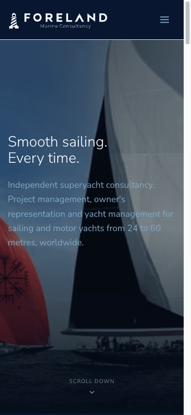
The imagery is genuine racing and yard photography rather than stock: J Class under sail, welders in dry dock, timber planking, rig work, engine rooms. It is never shown at full brightness. Every image sits beneath a navy gradient at reduced opacity, which is what keeps the text above it legible and keeps the pages looking like one site rather than a gallery.
The site
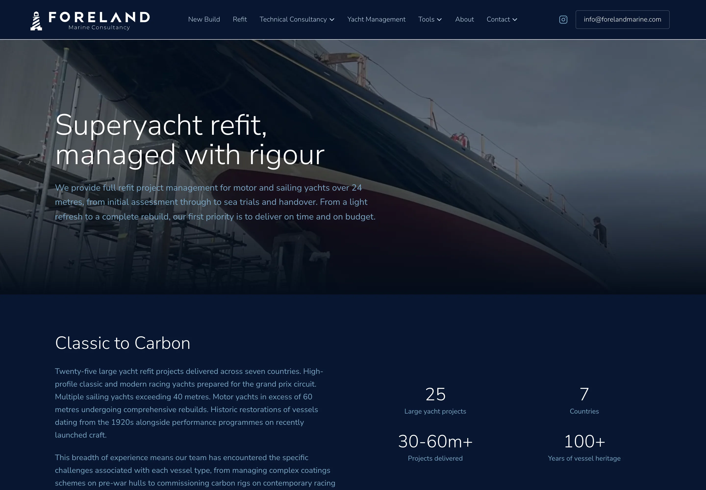
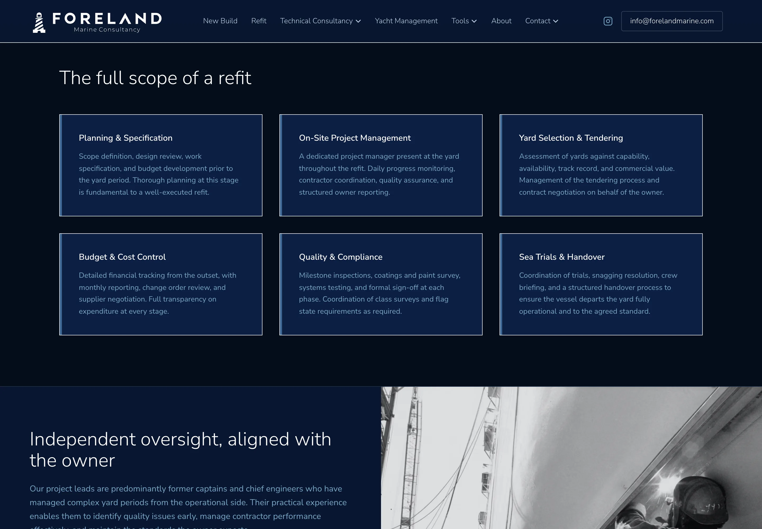
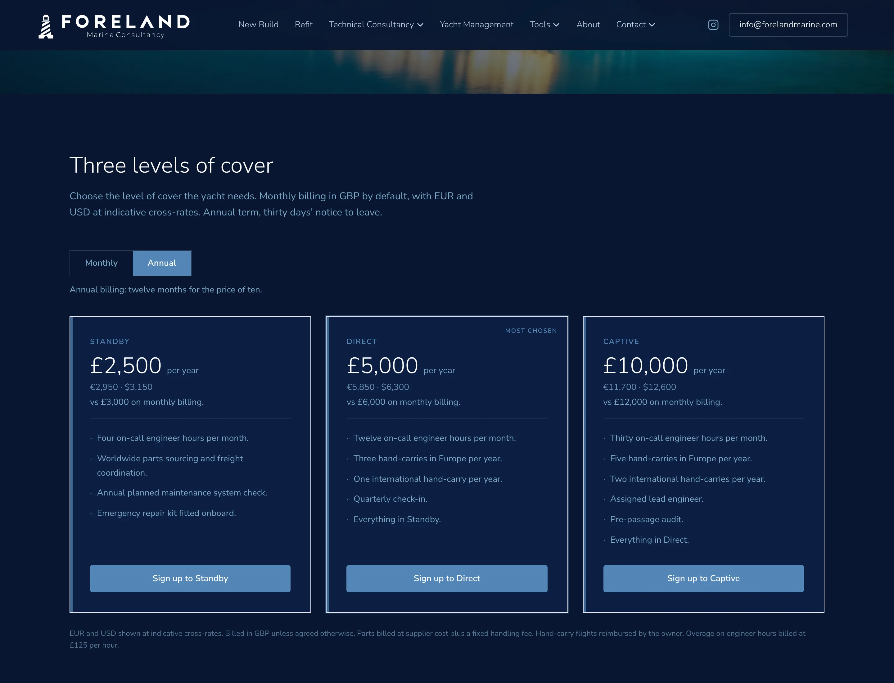
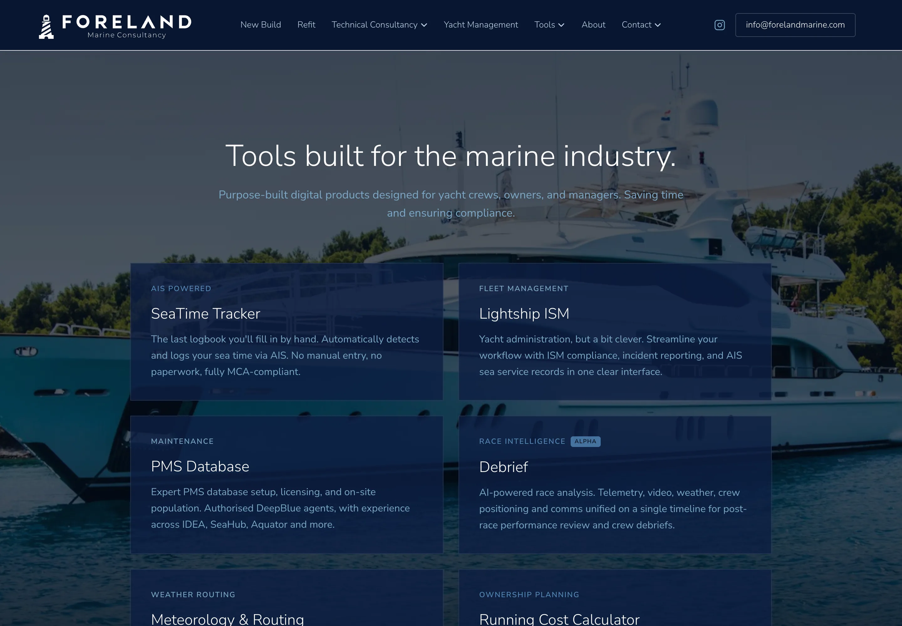
The site runs to sixty-five pages and carries a good deal more than the four consultancy services. Alongside them sit a paid technical support product on three subscription tiers, six self-serve tools, a journal, a quarterly newsletter archive and a private membership area entered by invitation code.
Every service page is written in the register of a private memo rather than a sales deck, with plain language, real numbers and named clients where permission allows. Each carries FAQ structured data, so the answers can be quoted accurately by search and by answer engines.
Page inventory
- Four service pagesRefit, owner's representation, yacht management, technical consultancy
- Technical SupportThree paid tiers with Stripe checkout and invoicing
- Six toolsSea time tracker, Lightship ISM, running cost calculator, PMS database, weather routing, debrief
- Insights journalArticles with OpenGraph images generated per article
- Newsletter archiveThe Foreland Quarter, issue by issue
- Foreland GroupMembership gated by invitation code, with logged downloads
Architecture
There is more infrastructure behind the pages than the front of the site suggests. Stripe handles the support subscriptions through a custom checkout and webhook flow, Resend sends transactional email from branded templates, and Supabase records membership interest, verifies invitation codes and logs gated downloads.
Front
Next.js App Router
Sixty-five pages, no marketing pixels
Tailwind
Tokens mirror the brand kit
Generated OG images
Per article, at request time
Server routes
enquiry
Contact and service enquiries
stripe
Checkout sessions and webhooks
technical-support
Subscription tiers
foreland-group
Invitation codes and gated downloads
pay
Payment links and invoicing
reports, banking, i
Client reporting and short links
Services
Stripe
Subscriptions, checkout, invoices
Supabase
Membership, codes, download log
Resend
Branded transactional email
Vercel
Hosting and edge delivery
- •OpenGraph images are generated per article at request time rather than at build, so a new piece never ships without a card.
- •Two llms.txt files, an index and a full corpus, give AI search systems an accurate source to cite rather than a guess.
- •Parallax and scroll reveals are written against the browser's own APIs. No animation library is shipped to the visitor.
- •ProfessionalService, Service, Person and FAQ structured data sit on the relevant pages.
- •Images are served as AVIF and WebP at responsive sizes, with heroes preloaded and everything else loaded lazily.
What the refit service page weighs
- Transferred
- 1.4MB
- Requests
- 39
- DOM nodes
- 437
When it paints
- First contentful paint
- 196ms
- Largest contentful paint
- 252ms
- Load complete
- 232ms
Measured on 25 September 2026 by loading forelandmarine.com/refit twice in headless Chrome at 1440 pixels with the cache disabled, and keeping the better run. This is a desktop connection on a fast line, so the paint figures are a floor rather than a field measurement. The transfer weight and request count are the numbers worth comparing, because they do not change with the connection.
Voice
The written rules are part of the identity rather than an afterthought, because on a site with this much copy the writing is more visible than the mark. The register is professional but not stuffy, technical without piling up jargon, and direct about costs, risks and conflicts of interest.
Fixed rules
- Spelling
- British English
- Em-dashes
- Never
- Exclamation marks
- Never
- Numbers
- One to nine in words, 10 up in figures
- Measurements
- Always figures, always metres
Terms
- Vessels over 24m
- Yacht, not boat
- International currency
- EUR
- UK currency
- GBP
- Superlatives
- Avoided
This is how we work on every project. If it suits what you are building, we should talk.
Talk to Faro