Design and build notes
Watermans
A superyacht agency for London, the Solent and the south west, designed as a pilot book: one typeface, the colours of a chart, and every figure a captain needs published and dated.
- Client
- Watermans, part of the Foreland Group
- Sector
- Superyacht agency
- Year
- 2026
- Scope
- Brand identity, Website design, Development, Arrival planner, Pilotage content, Search and answer engines
The commission
Watermans is the UK arrivals arm of Foreland Marine, a superyacht agency for London, the Solent and the south west. It books berths, arranges pilotage and bridge lifts, clears yachts in and out with Border Force, and attends on the quay at arrival and departure. The commission was the identity and the website, written for a captain planning a UK visit from somewhere else.
A captain arriving in an unfamiliar port has a short list of questions: where the yacht can lie, who takes the pilot and where, whether the bridge has to lift, what has to be filed and by when, and what the call will cost. The brief was a site that answers those questions directly, with sources and dates, rather than a brochure that asks the captain to get in touch before learning anything.
The design took more turns than the build. The commit history shows thirteen font families loaded across ten type settings in the first two days, before the site settled on one grotesk and the colours of a chart. Each change was committed and judged on the real pages, which is why the record of what was rejected is complete.
- 21 Sep 13:19First build, as Foreland AgencyIBM Plex Sans and Mono on warm paper, with code flag G, I require a pilot
- 21 Sep 14:03Renamed Watermans, rebuilt as a chart documentLibre Caslon on chart paper, and flag H, I have a pilot on board, in place of G
- 21 Sep 16:17Rebuilt in the Foreland Group systemNunito Sans, navy and cinematic photography. The flag was redrawn on a staff at the weight of the Foreland lighthouse
- 21 Sep 17:58Rebuilt around an arrival plannerThe planner replaced the hero as the first thing on the page
- 21 Sep 19:22Monochrome with blue and whiteThe direction that survives, first set in Schibsted Grotesk
- 21 Sep 19:46Archivo arrivesAdopted in an interface audit, with the width axis loaded
- 22 Sep 20:39Three type trials in nineteen minutesCaslon with Public Sans, Public Sans alone, then Libre Franklin
- 22 Sep 20:58Returned to Archivo and the original scale
- 23 Sep 13:39Ports on one pilot-book templateBrief, approach, pilotage, tides, berths, alongside, ashore and events, in that order on every port
- 24 Sep 16:52Live on watermansagency.comWith structured data, preview cards and the answer-engine files
- Commits
- 170
- Elapsed
- 3d 3h 35m
- Font families
- 13
- Type settings
- 10
Taken from the project's commit history. The font family count covers every family loaded at any commit, including monospace and display cuts; a type setting is each change to the set of families loaded. Only the commits that changed a decision are listed.
The mark
The mark is flag H of the International Code of Signals, flown by a vessel to say that it has a pilot on board. The first build used flag G, I require a pilot, which describes the moment before the agent has done the job. H describes the moment after, and it replaced G in the same commit that gave the firm its name.
Flag H is divided vertically, white at the hoist and red at the fly. It is drawn here as line art on a staff, with the white half left open and the red half filled, at the stroke weight of the Foreland lighthouse so that the two marks sit together on a group page. Signal red appears on the flag and on the rule beside the enquiry form's status message, and nowhere else.


Watermans
YACHT AGENTS
The flag on its 40 by 48 unit artboard. The staff is a 2.6 unit stroke with round caps from y 2 to y 46; the flag is a 34 by 23 unit rectangle with a 2.4 unit stroke; the red half is a 17 by 23 fill laid over the inner half of that stroke, so a thin line of ink stays around the red. The drawn ink measures 36.5 by 46.6 units.
- Aspect ratio
- 0.78 : 1
- Measured from the drawn path
- Artboard
- 40 × 48
- viewBox units
- Drawn ink
- 36.5 × 46.6
- Staff stroke
- 2.6
- Round caps
- Flag stroke
- 2.4
- Flag, outer edge
- 36.4 × 25.4
- Colours
- 2
- Ink or white, and signal red
Three parts, each with a reason. The staff is what makes it a flag flown rather than a coloured rectangle.
- 1The staff. Runs 44 units with round caps. Its foot sets the baseline the lockup is measured to.
- 2The hoist. The white half, left open as outline. On a white page the ground shows through, as it would on the flag itself.
- 3The fly. The red half, filled in signal red, laid over the inner half of the outline.
The header lockup is measured in the browser rather than set by hand. On load, the narrower of the two lines is letter-spaced out to the width of the wider, never compressed, and the flag is scaled so that its top edge meets the cap line of Watermans and the foot of the staff meets the baseline of Yacht agents. Both figures are read from the font's own metrics, because letter-spacing and font metrics cannot be known in CSS. The lockup therefore stays square at any size and in any fallback font.
12px16px24px32px48px96pxThe mark at working sizes. The outline carries the white half, so below about 16 pixels the stroke begins to close the hoist and the flag reads as a red square on a staff. The favicon is therefore a separate drawing: the flag on a night square with the white half filled solid and a heavier 3 unit staff, so it holds at 16 pixels.
Colour
The palette is monochrome, with blue and white. The tokens are named after the parts of an Admiralty chart: chart white for the paper, ink for the print, soundings and shoal for the two greys, datum for the rules that everything is measured from, and slack for the tinted band. One blue, pilot, is taken from the Foreland palette so that the two firms read as related.
Blue carries a meaning rather than a mood. It marks a deadline, a link or an action, and nothing else. A label that carries no time limit is set in grey. An earlier version held quiet labels in blue with reduced opacity; it measured 3.7 to 1 and spent the colour on things that did not need it, so it was changed to grey.
Chart
#FFFFFF
255, 255, 255
The page
Ink
#0F1A2B
15, 26, 43
Type, heavy rules and the mark
Soundings
#47566C
71, 86, 108
Body copy
Shoal
#637082
99, 112, 130
Captions and quiet labels
Datum
#D5DDE6
213, 221, 230
Hairline rules between sections
Field
#7D8B9F
125, 139, 159
Form field boundaries and link underlines
Pilot
#2F6096
47, 96, 150
Deadlines, links and actions
Slack
#F2F6FA
242, 246, 250
The tinted band
Night
#08182F
8, 24, 47
Photograph tint and dark bands
Signal
#C8102E
200, 16, 46
The flag, and the rule beside a form message
Measured contrast
| Pair | Sample | Ratio | WCAG 2.1 |
|---|---|---|---|
| Ink on chart | Sample text | 17.5:1 | AAA |
| Soundings on chart | Sample text | 7.5:1 | AAA |
| Shoal on chart | Sample text | 5.0:1 | AA |
| Pilot on chart | Sample text | 6.5:1 | AA |
| Pilot on slack | Sample text | 6.0:1 | AA |
| Field on chart | Sample text | 3.5:1 | AA large |
| White on night | Sample text | 17.8:1 | AAA |
Ratios are computed from the hex values on this page under WCAG 2.1, not quoted from the brand document.
Field is the one colour chosen for a threshold rather than a role. Form fields need a visible edge, and the rule for non-text contrast is 3 to 1, so field was set to clear that on both the white page and the slack band. It never sets text.
Page heroes run as a navy duotone. Each photograph is taken to greyscale with a slight lift in contrast, then night is laid over it in the colour blend mode at 85 percent. Pictures from many photographers, taken in different light, read as one set, and white type can sit on any of them. Photographs set beside prose, and the homepage cards, stay in colour, because there they are showing a place rather than carrying a title.
The duotone
- Filter
- grayscale(1) contrast(1.08)
- Overlay
- Night, colour blend
- Overlay opacity
- 0.85
- Hero gradient
- Night at 90%, 35%, 45%
Where colour appears
- Blue
- Deadlines, links, actions
- Red
- The flag and form messages
- Photographs
- Duotone in heroes, colour beside prose
- Focus ring
- Pilot, white on night
Typography
The site uses one typeface, Archivo, with its width axis loaded. A ship carries her name across the transom in wide, flat letters because the transom is wide and flat, and a port notice is set narrow because the column is narrow. Archivo can do both from one file, so headings are widened to 112 and labels narrowed to 88, and the site needs no second family.
Getting there took three late trials. On the evening of 22 September the site was set in Caslon with Public Sans, then Public Sans alone at a light display weight, then Libre Franklin, all within nineteen minutes. Each was judged on the live pages against the tables and the planner, and each lost to the original. Archivo was restored with its original scale at 20:58.
Archivo
Display, reading, labels and figures
Variable, width 62 to 125
Widened to 112 for headings, narrowed to 88 for uppercase labels, and set at 108 with tabular figures for numbers that line up.
ABCDEFGHIJKLMNOPQRSTUVWXYZ
abcdefghijklmnopqrstuvwxyz
0123456789 & £ € , . ; : ( ) “ ”
Pilotage at Falmouth is by zone.
| Step | Size | Role | Family | Weight | Line height | Tracking | Set |
|---|---|---|---|---|---|---|---|
| Hero | clamp(2.2rem, 5vw, 5.6rem) | Page title on the photograph | Archivo | 500, width 112 | 0.96 | −0.025em | Aa |
| Statement | clamp(1.5rem, 2.7vw, 3.2rem) | The homepage statement | Archivo | 500 | 1.1 | −0.025em | Aa |
| Section | clamp(1.5rem, 2.2vw, 2.1rem) | Pilot-book headings | Archivo | 500, width 112 | 0.96 | −0.025em | Aa |
| Lede | 1.25rem | Standfirst, in pilot blue | Archivo | 400 | 1.5 | — | Aa |
| Body | 1.125rem | Running text, in soundings | Archivo | 400 | 1.6 | — | Aa |
| Label | 0.8125rem | Uppercase port-notice labels | Archivo | 400, width 88 | 1.4 | 0.16em | Aa |
| Caption | 0.8125rem | Credits, sources and notes | Archivo | 400 | 1.5 | — | Aa |
Above 1600 pixels the layout keeps growing, so the reading sizes grow with it: body to 1.25rem, lede to 1.5rem, captions and labels up a step. Scaling only the headings left the running text looking miniature on a wide display. Links are underlined at 1 pixel with a 0.22em offset rather than bordered, because a border belongs to the box and floats away from the word once the link is padded out to a thumb-sized target.
Layout
Everything that is not a photograph sits in a 110rem shell. Running text sits in its own centred reading measure inside it, 48rem wide and 55rem above 1600 pixels, because a 60 character column left-aligned in a wide shell leaves two thirds of the page empty and reads as unfinished.
Vertical spacing comes in three densities, and each one means something. Open is for a statement meant to be read slowly, standard is for reference matter, and tight is for lists and tables where the data is the point. Tinted bands and photographs run to the window edge while their contents re-centre on the shell.
Band padding, desktop
- Open
- 5.5rem × 3rem
- Standard
- 3.5rem × 3rem
- Tight
- 2rem × 3rem
Measures
- Shell
- 110rem
- Reading measure
- 48rem
- Tables
- Scroll sideways on a phone
- Rules
- Datum hairlines, ink under the header
The site
The homepage opens on a photograph of a yacht alongside in London with the arrival bar laid across its foot: port, length overall, air draught and the date alongside. Those four answers are enough to plan the call, so the first thing a captain can do on the site is start.
Every port page follows one template, taken from the order a pilot book uses: brief, approach, pilotage, tides, berths, alongside, ashore and events. Running notes are short paragraphs, and anything a captain would look up stays a table. Each page carries a vector nautical chart, the next tides at its own station, and the sources the page was written from.
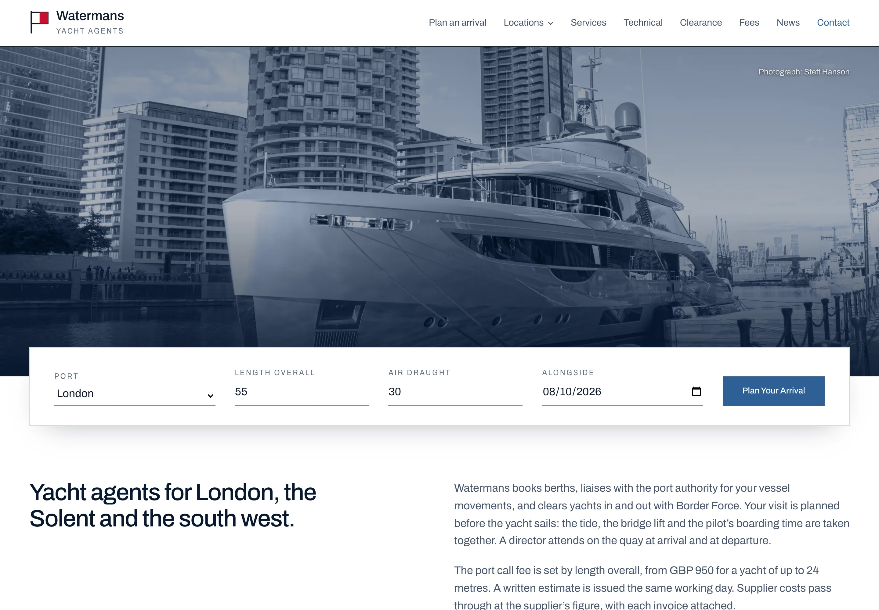
Page inventory
- Plan an arrivalBerths, notice deadlines and charges from four inputs
- Nine port pagesLondon, Southampton, Portsmouth, Cowes, Poole, Dartmouth, Plymouth, Fowey and Falmouth, all on the pilot-book template
- Services, technical, clearanceProse beside photographs, alternating sides down the page
- FeesThe port call fee by length overall, the further rates and two worked examples
- From the Caribbean, the seasonA landfall at Falmouth, and the year in British waters
- Notices and newsDated rule and port changes, each with its source
- The firm, agents, contactThe directors, a page written to other agents, and the enquiry form
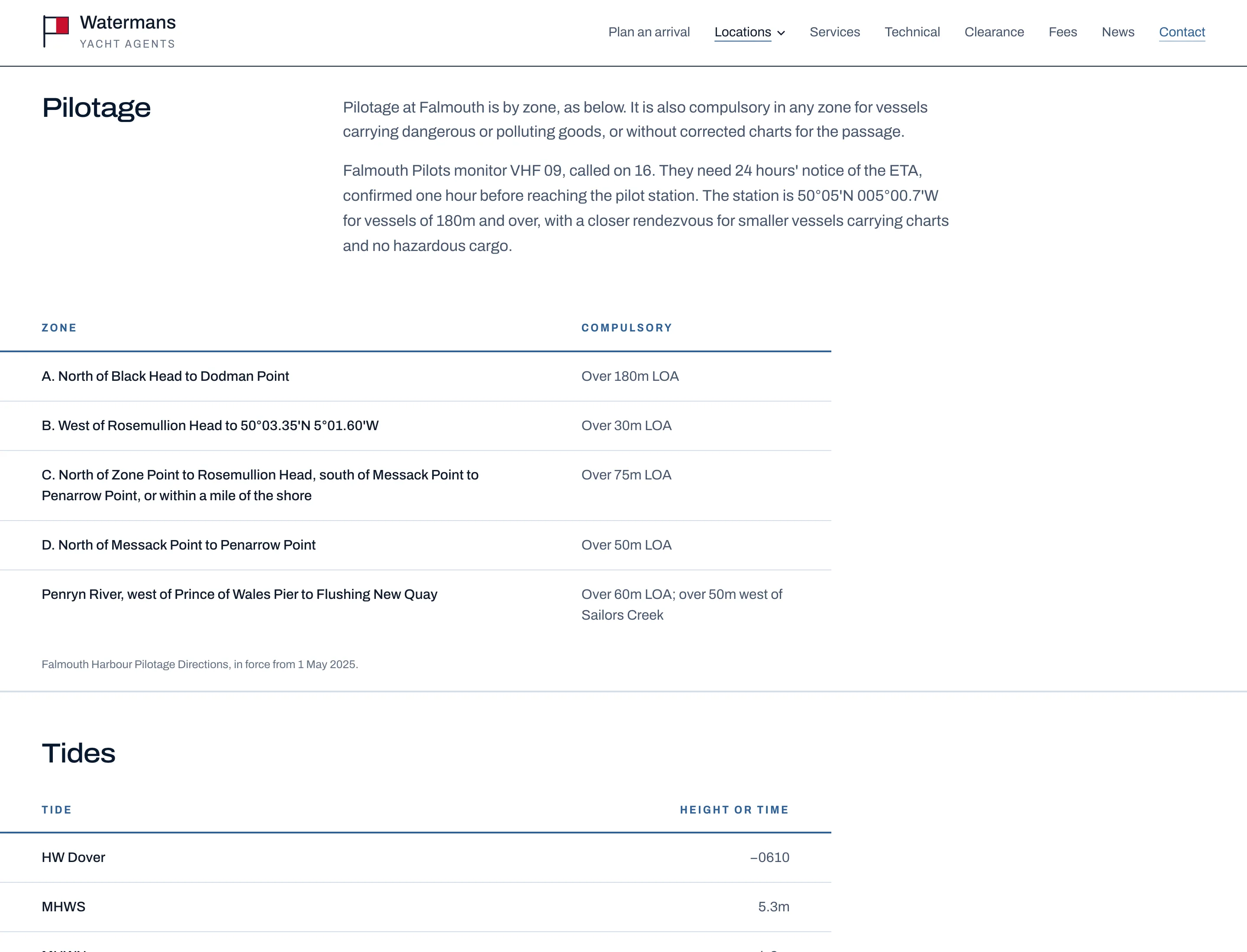
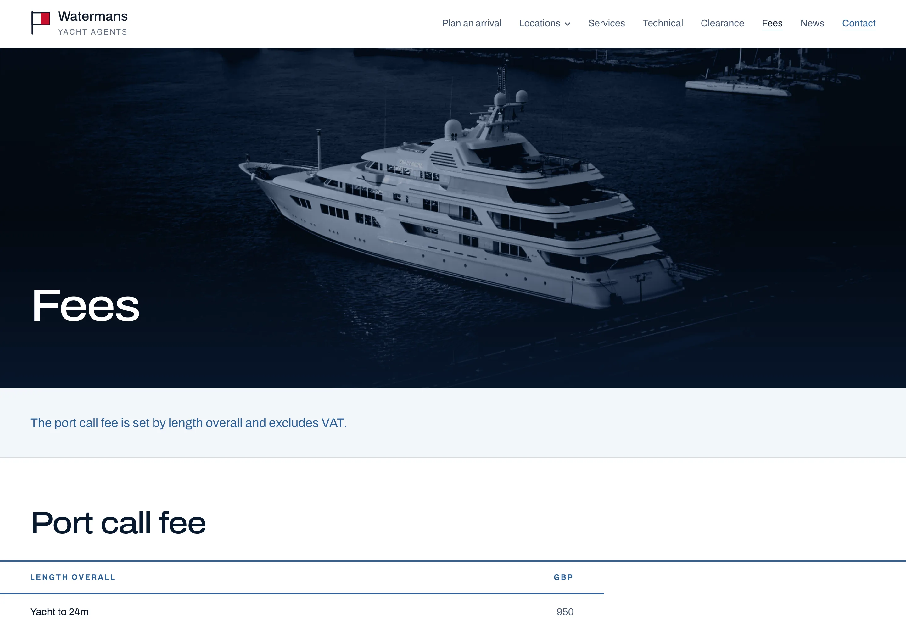
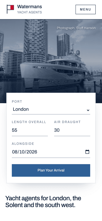
The arrival planner
The planner is the reason the site exists in this form. A captain chooses a port and enters the length overall, the air draught, where the pilot boards and the time alongside. The planner returns the berths that can take the yacht, with the ones that cannot struck through and the reason given, every notice deadline as a date and time counted back from arrival, and the charges line by line.
Every figure is published. London pilotage comes from the Port of London Authority's schedules of rates and charges, berth limits from PLA mooring information and the operators, and the notice periods from the port's own rules. All of it lives in one file, which is revised each January when the tariff changes, and nothing else on the site needs touching.
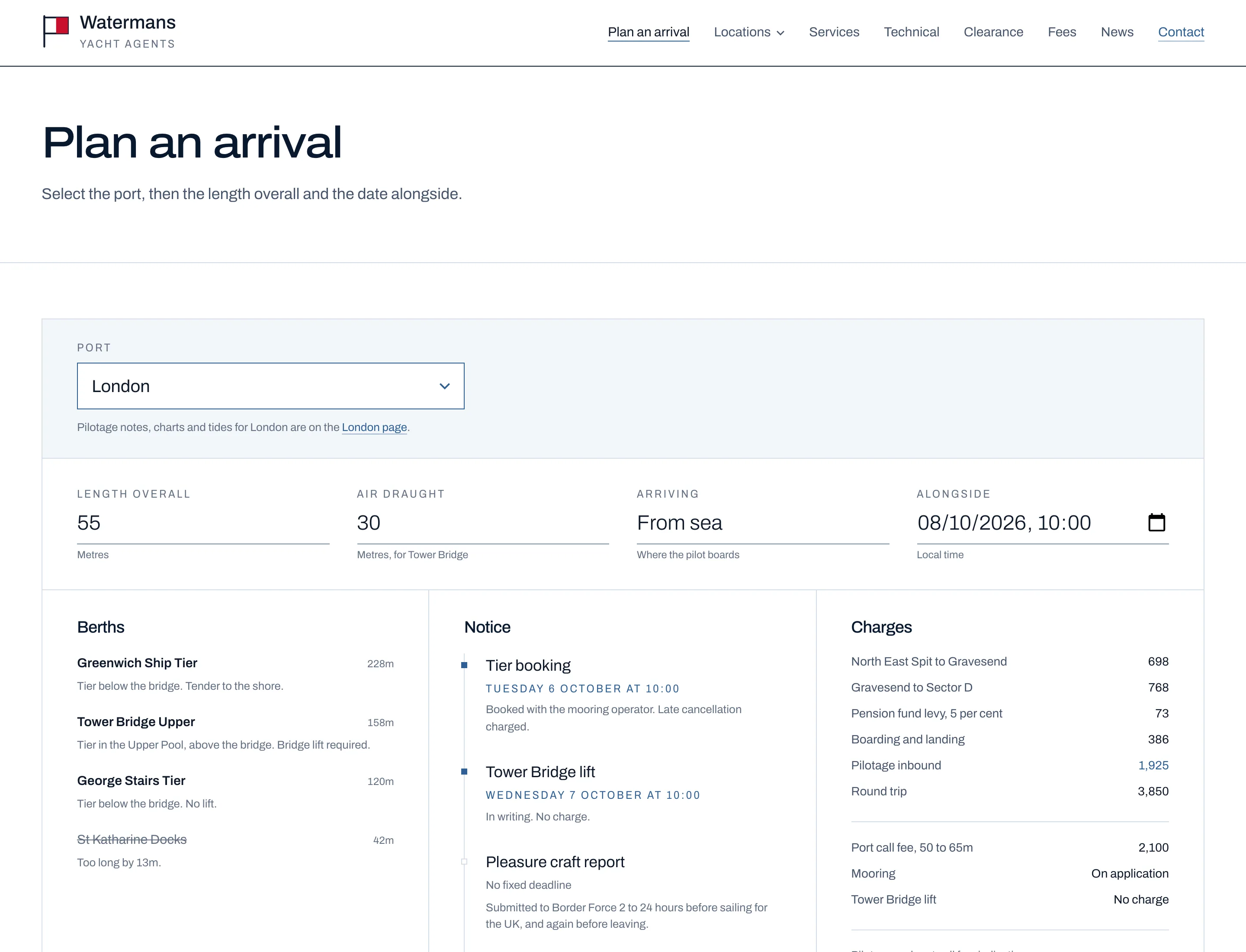
London rules the planner applies
- Pilotage compulsory
- Over 40m
- Bridge lift
- Air draught of 9m or more
- Tier booking
- 48 hours before
- Bridge lift request
- 24 hours before
- Pension fund levy
- 5%
Live data
- Tower Bridge lifts
- Published schedule, cached an hour
- Tides
- UKHO Admiralty tidal API
- Charts
- savvy navvy vector chartlets
- Output
- Indicative, and says so
Both live sources fail quietly. There is no official API for Tower Bridge lifts, so the schedule is parsed from the published page; if that page changes shape the parser returns nothing and the panel disappears rather than showing something wrong. The tide panel carries the Admiralty's statement that the data is for planning and not for navigation, and that line stays.
From the planner, Request this estimate carries the port, length, air draught and time alongside into the enquiry form, so the captain does not type them twice.
The build
Pages
Next.js 16 App Router
Static pages, rendered at build
Pilot-book template
One component for every port
Tailwind v4 tokens
The chart palette as theme variables
Data
arrival.ts
Tariffs, berth limits and notice rules, revised each January
Tower Bridge lifts
Parsed server side, cached for an hour
Admiralty tides
Next tides at each port's station
Reach
Enquiry form
Built on Resend, prefilled from the planner
Structured data
Service, Place, FAQ, breadcrumb and news schema
Answer engines
llms.txt, named crawlers in robots, IndexNow
- •Every port page answers the questions a captain asks in a set of FAQs, shown on the page and marked up, so search engines and answer engines quote the page rather than paraphrase it.
- •Preview cards are generated for each page on the night ground with the wordmark and the page title, so a link shared in a message says what it opens.
- •Photographs are credited on the image and listed with their licences in the repository. Commons downloads are opened and decoded before they ship, because a truncated file can pass a size check.
- •Tables wider than a phone scroll sideways, with the right edge faded as the only cue that there is more.
What the homepage weighs
- Transferred
- 1.6MB
- Requests
- 53
- DOM nodes
- 299
When it paints
- First contentful paint
- 196ms
- Largest contentful paint
- 384ms
- Load complete
- 359ms
Measured on 24 September 2026 by loading www.watermansagency.com/ twice in headless Chrome at 1440 pixels with the cache disabled, and keeping the better run. This is a desktop connection on a fast line, so the paint figures are a floor rather than a field measurement. The transfer weight and request count are the numbers worth comparing, because they do not change with the connection.
The project README still describes the Foreland Group rebuild of 21 September, with Nunito Sans and a navy ground. The site moved on from that within three hours. The tokens in globals.css are the source of truth, and they are what this document records.
This is how we work on every project. If it suits what you are building, we should talk.
Talk to Faro