Design and build notes
Nimāra
A reformer pilates brand built to be the one studio in its category that does not look like the others, drawn from a forty brand audit and a thirty-six study exploration.
- Client
- Nimāra
- Sector
- Pilates and wellness
- Year
- 2026
- Scope
- Competitor audit, Brand identity, Asset library, Website design, Development, Four language localisation, Print artwork
The audit
The work started with a review of more than forty studios across Mallorca, London, Paris, the global aspirational tier and adjacent wellness brands, each recorded by logo, typeface, palette, motif and positioning line. The point was not inspiration. It was to establish, before anything was drawn, exactly which decisions would make Nimāra indistinguishable from its competitors.
The audit found a category converging hard. Cream or bone backgrounds with sage or forest green appeared in eighteen of forty studios. Lowercase sans-serif wordmarks appeared in twenty-eight of forty, and at thumbnail size they are not separable from one another. Hand-drawn brushstroke marks appeared in seven, and lotus, leaf or wave motifs in five, both reading as yoga rather than pilates.
One gap was consistent across all three cities. Nobody at the top of the category was using an editorial serif, and nobody was using a figurative mark with any heraldic weight to it. That gap became the brief.
What the field was doing
- Cream or bone with sage green
- 18 of 40
- Lowercase sans-serif wordmark
- 28 of 40
- Brushstroke or single ink line
- 7 of 40
- Lotus, leaf or wave motif
- 5 of 40
- Editorial serif
- None
What Nimāra does instead
- Display face
- Editorial serif
- Wordmark
- Roman capitals
- Mark
- Figurative, heraldic
- Greens in the palette
- One
- Case for headings
- Sentence, never title
The name
The studio was not called Nimara first, and the record of that is unusually clear. The site was built and shipped in full under the name Re:Connect Pilates, renamed five days later to BE:LiVE, and renamed again two days after that to Nimara. Three names in eight days, with a complete website rebuilt around each one.
The first two share a fault that the audit had already flagged. Both are constructions rather than words, both use internal punctuation as a device, and both describe a benefit. A studio called Re:Connect is telling you what it will do for you, which is the register of a wellness advert. Nimara does not mean anything, which is the point: it can be given a meaning rather than arriving with one, and it holds a Roman capital setting where a colon cannot.
The macron came later still. NIMĀRA rather than NIMARA gives the eye a reason to slow down on a word it does not recognise, and it fixes the stress on the second syllable. It is the smallest decision in the identity and one of the few that is genuinely non-negotiable.
- 2 April 2026Built as Re:Connect PilatesA complete site, shipped under the first name, with a brand identity kit alongside it
- 7 April 2026Renamed to BE:LiVEA second constructed name, carrying the same punctuation device
- 9 April 2026Renamed to NimaraThe name that held, still without its macron. The wordmark work starts here
- 10 April 2026Domain and project renamednimarapilates.com, with the hosted assets and signatures following
- 22 August 2026Copy pass across all four languagesFluent British English as the source, with the three translations reworked to match
- 7 September 2026Opening print goes to pressThe opening flyer, the discovery flyer and the window vinyl, all drawn off the same system
- 11 September 2026The studio opensBooking, retail and the timetable go live on the site, and the pre-launch copy comes off
- Commits
- 402
- First to opening
- 23 weeks
- Names
- 3
- Days to settle
- 8
Dates taken from the project's commit history. The two earlier names are still in it.
The exploration
Thirty-six numbered studies were drawn before anything was locked. The first eight set the broad direction: an editorial serif, an architectural monogram, an organic handcrafted route, a modernist geometric route, and four typographic devices. The remaining studies narrowed the figurative mark, working through Mallorquin architectural motifs, the persiana shutter, ironwork, paired arches and stone reveals, before turning to the leopardess.
The leopardess itself was drawn thirteen ways: profile silhouette, line, guardant, engraving, sigil, vignette, passant, eye, rosette, couchant, mask, ridge and cartouche. The engraved, rosette and cartouche versions carry internal detail that fills in the moment the mark is reduced, and they were set aside on that basis. The form that locked is the leopardess mid-stretch, drawn as an open line.
The first eight are worth showing, because they are dated in a way that is easy to verify. Six of the eight set the wordmark in Cormorant Garamond, the face that was later replaced by Newsreader. Three use the mid-sage that the audit had already identified as the colour shared by eighteen of the forty studios, and which was struck out of the palette at the lock. None of them carry the macron: they all read NIMARA rather than NIMĀRA, because the macron was not yet part of the name.
In other words, the sketches still contain three of the decisions the finished brand exists to avoid. That is what an exploration set is for.
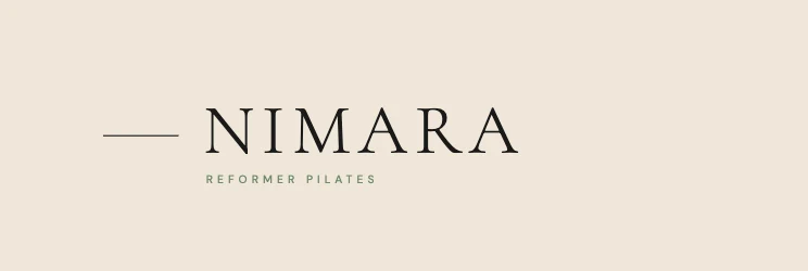
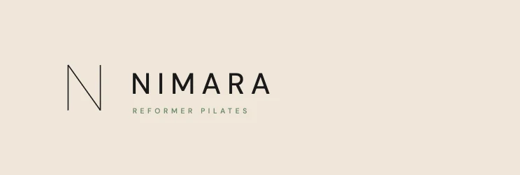
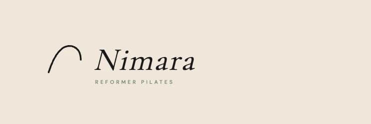

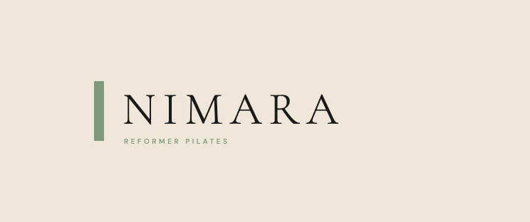
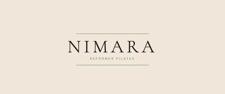
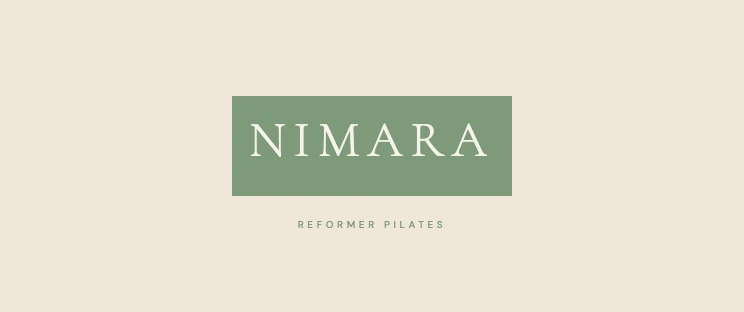
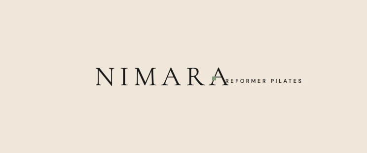
The brand-system document still describes the small mark as a Mallorquin arch, marked to be decided. That entry predates the lock and was never revised. The leopardess is what ships, in the asset library and on the site, so this document is written from the shipped assets rather than from the older text.
The mark
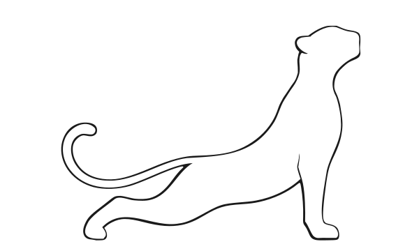
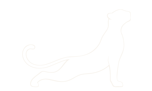
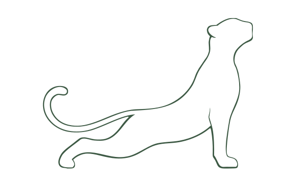
The mark is a Mallorquin leopardess mid-stretch, drawn as an open line with no ornament and no enclosing shape. It carries the identity from the website header up to a one metre window sticker.
NIMĀRA
REFORMER PILATES
The leopardess on its 600 by 360 unit artboard. The drawn ink measures 428.54 by 307.80 units, a ratio of 1.392 to 1, and sits off centre on the artboard with more air at the top than the bottom because the raised forepaw needs the room. The mark is always sized by height, never by width, so that ratio is the only proportion that has to be respected.
- Aspect ratio
- 1.39 : 1
- Measured from the drawn path
- Construction module
- 76.95 units
- A quarter of the mark height
- Artboard
- 600 × 360
- viewBox units
- Drawn ink
- 428.54 × 307.80
- Artboard air, top
- 36.90 units
- Artboard air, left
- 87.63 units
- Default cut
- Outlined
- Line converted to fill, no stroke
- Stroked cuts
- 1.3 and 3.0
- Fine and heavy, in artboard units
The default cut carries no stroke at all. The drawn line has been converted to outlines and filled as an even-odd band, so the file reproduces as a line drawing without depending on how a renderer handles stroke widths. That is what the website and most print work use.
Two stroked cuts sit alongside it. A fine cut at a 1.3 unit stroke is drawn for embroidery and foil blocking, where a line has to be given a thickness the machine can follow. A heavy cut at 3.0 units is drawn for large format, where a fine line disappears at viewing distance.
A line drawing has one genuine weakness, and this one has it: below roughly forty-eight pixels the band closes up and the animal is no longer readable. Rather than pretend otherwise, a fourth cut exists for small sizes. It is a solid silhouette built from the outer contour of the outline mark's own band, so the pose and the grid are identical, measuring the same 428.54 by 307.80 units. It is a single subpath with no fill-rule dependency, which means it renders the same way everywhere, and line weights do not apply to it. This is the cut the favicons and app icons use.
16px32px48px64px120px220pxThe outline cut, run down to favicon sizes. It is comfortable from about sixty-four pixels and gone by sixteen, and this test is the reason the silhouette cut exists. Judging a mark at presentation size and shipping it without this check is the usual mistake.
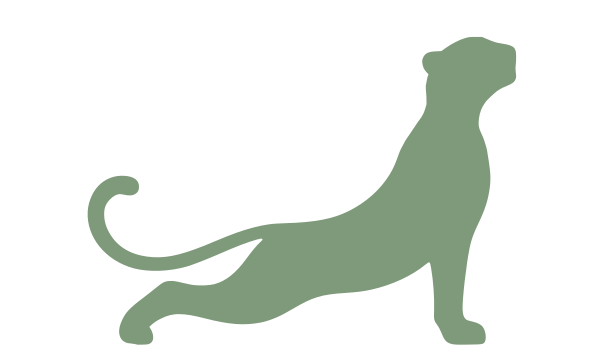
The favicon places that silhouette on a solid tile: the mark in the lighter sage on a deep green ground, inset 22 units on a 360 unit square, so the animal occupies 316 of the 360 and reads as a single shape in a browser tab. Cuts are supplied at 16, 32, 48 and 64 pixels, with an Apple touch icon at 180.
The wordmark is the most controlled element in the system and does not flex. It is set in Cinzel at 400 on the web and Trajan Pro in production print, always in capitals, always with the macron over the second A. The macron is part of the name rather than a decorative flourish, and removing it is not a permitted variation.
Wordmark
- Web face
- Cinzel 400
- Print face
- Trajan Pro Regular
- Setting
- NIMĀRA, all capitals
- Tracking
- 14 / 52 em
- Clear space
- 0.5 × cap height
- Minimum size
- 100px, 25mm
Sub-line
- Face
- DM Sans 500
- Setting
- REFORMER PILATES, caps
- Tracking
- 0.4em
- Size
- 10 / 56 of the wordmark
- Colour
- Ink at 62%
- Below minimum
- Mark alone, no wordmark
The brand system sets a clear space rule for the wordmark, half its cap height on every side, and none for the mark. That gap is deliberate rather than an oversight: the leopardess is placed at a size and a position by whatever surface it sits on, from a nav bar to a one metre window sticker, and a fixed exclusion zone would be wrong at one end of that range or the other. The wordmark, which is always set at a known size relative to its own cap height, can carry a rule that holds everywhere.
What the mark does have is a short list of things that are not permitted, all of which follow from it being one drawing used at every size rather than a family of drawings.
There are three approved wordmark lockups and one small mark. The primary horizontal sets NIMĀRA over the sub-line on a centred axis with the cap heights aligned. The stacked version opens the gap for square formats, avatars and embroidery. The wordmark alone, without the sub-line, is used for editorial contexts and large format signage. The small mark substitutes for the wordmark wherever the wordmark cannot be read, and it is never set alongside the wordmark on the same surface: it replaces, it does not decorate.
Colour
The palette holds a single accent. The category's habitual mistake is to carry three sage tones, a deep, a mid and a light, which produces a palette indistinguishable from every other studio's. Nimāra carries one. Hover and emphasis states are made with opacity rather than with a second green, which is the discipline that keeps the system tight as it grows.
Four tokens were removed during the lock rather than kept for safety. The mid sage that eighteen of the forty audited studios share went first. A soft mist green went with it, on the grounds that softness should come from alpha. A second warm neutral was collapsed into oak, because two warm neutrals was one too many.
Sand
#EFE6D8
239, 230, 216
Primary surface, the default page
Cream
#F7F3ED
247, 243, 237
Alternating sections, cards, callouts
Warm black
#0F0E0C
15, 14, 12
Footer and immersive sections. Never a text colour
Ink
#1A1A1A
26, 26, 26
Headings, body, wordmark, mark
Stone
#6B6B60
107, 107, 96
Secondary text, captions, metadata
Sage
#7E9A7A
126, 154, 122
The single accent. Section labels, links, markers
Oak
#C2A87A
194, 168, 122
Rules, borders and ornament only. Never text
Measured contrast
| Pair | Sample | Ratio | WCAG 2.1 |
|---|---|---|---|
| Ink on sand | Sample text | 14.1:1 | AAA |
| Ink on cream | Sample text | 15.7:1 | AAA |
| Stone on sand | Sample text | 4.4:1 | AA large |
| Stone on cream | Sample text | 4.9:1 | AA |
| Cream on warm black | Sample text | 17.5:1 | AAA |
Ratios are computed from the hex values on this page under WCAG 2.1, not quoted from the brand document.
Semantic mapping
- Surface, primary
- Sand
- Surface, secondary
- Cream
- Surface, deep
- Warm black
- Text, primary
- Ink
- Text, secondary
- Stone
- Text on dark
- Cream at 70 to 90%
Borders and states
- Border, default
- Ink at 12%
- Border, emphasis
- Ink at 24%
- Hover
- Sage at 70%
- Second green
- None
- Decoration, warm
- Oak
Typography
Three faces divide the work and never cross into one another's territory. Cinzel is Trajan-derived Roman capitals and is reserved for the wordmark, which means it never appears in a heading or a paragraph anywhere on the site. Newsreader carries the editorial voice. DM Sans handles body, navigation, labels and metadata, with a tabular cut for pricing and schedules.
Cinzel
Wordmark only
Trajan-lineage Roman capitals, reserved exclusively for NIMĀRA and the small mark. It is never used for headings or body copy.
Newsreader
Display and editorial headings
200 to 400. Fallbacks: Lyon Display, Tiempos Headline, Georgia
Hero, section heads and pull quotes, always in sentence case. The scale is harmonic on a 1.25 ratio rounded to legible values.
DM Sans
Body and interface
300 to 600. Fallbacks: Inter, system-ui
Body copy, navigation, labels, captions and metadata. Lining tabular figures are used wherever money or a schedule is set.
ABCDEFGHIJKLMNOPQRSTUVWXYZ
abcdefghijklmnopqrstuvwxyz
0123456789 & £ € , . ; : ( ) “ ”
Move. Breathe. Reconnect.
| Step | Size | Role | Family | Weight | Line height | Tracking | Set |
|---|---|---|---|---|---|---|---|
| t-9 | 96px / 6rem | Hero display | Newsreader | 200 | 1.04 | -0.018em | Aa |
| t-8 | 72px / 4.5rem | Page heading | Newsreader | 200 | 1.06 | -0.014em | Aa |
| t-7 | 56px / 3.5rem | Section heading | Newsreader | 300 | 1.1 | -0.012em | Aa |
| t-6 | 40px / 2.5rem | Sub-heading | Newsreader | 300 | 1.15 | -0.01em | Aa |
| t-5 | 28px / 1.75rem | Editorial lead | Newsreader | 400 | 1.3 | -0.005em | Aa |
| t-4 | 20px / 1.25rem | Body large | DM Sans | 400 | 1.6 | 0 | Aa |
| t-3 | 16px / 1rem | Body | DM Sans | 400 | 1.7 | 0 | Aa |
| t-2 | 14px / 0.875rem | Small | DM Sans | 400 | 1.65 | 0 | Aa |
| t-1 | 12px / 0.75rem | Caption | DM Sans | 400 | 1.6 | 0.01em | Aa |
| t-0 | 10px / 0.625rem | Label and eyebrow | DM Sans | 500 | 1.4 | 0.22em | Aa |
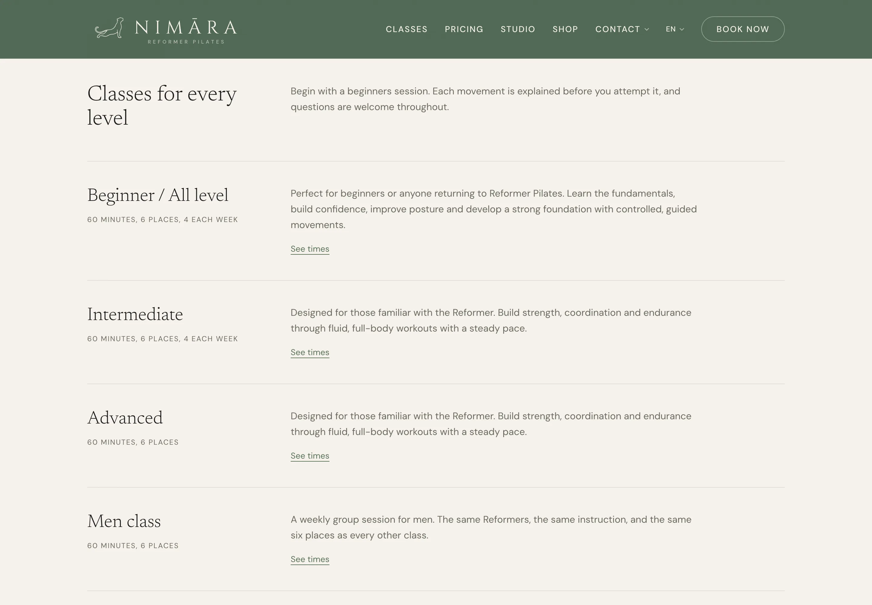
One rule governs every piece of text on the site: sentence case throughout, for headings, section labels, navigation and body alike. Title case is ruled out on the grounds that it reads as advertising, and the studio is meant to read as a publication. Capitals are reserved for the wordmark, the sub-line and the smallest editorial labels. It is the rule most likely to drift and the one worth enforcing hardest.
Layout
Spacing is the least visible discipline in the system and the one that does most for how the brand feels. The scale runs on an eight pixel base with a Fibonacci-influenced step, so the gaps between things grow at a rate the eye reads as deliberate rather than arbitrary.
Eight pixel base, Fibonacci-influenced step.
- s-18px
- s-216px
- s-324px
- s-440px
- s-564px
- s-696px
- s-7128px
- s-8192px
Editorial grid, full bleed to 1240 pixels
- Maximum content width
- 1240px
- Type column
- 664px
- 60 to 70 characters at body size
- Body line height
- 1.7
- Base size
- 16px
- Vertical rhythm unit
- 27.2px
- Every vertical gap is a multiple
The vertical rhythm follows from the body setting: 16 pixels at a line height of 1.7 gives a unit of 27.2 pixels, and every paragraph, heading, image and section margin is a multiple of it. This is the discipline that produces the sense that a layout breathes, without anyone quite being able to say why.
Motion
There is more motion here than on the other projects in this portfolio, and all of it is slow. A film grain sits across the whole viewport as a fixed layer, generated as fractal noise rather than loaded as an image, desaturated and held at three and a half percent opacity in multiply. It is the single element that does most to stop the photography looking like stock.
Lenis smooths the scroll and GSAP drives the reveals. The whole motion layer stands down for visitors who have asked for reduced motion.
| Name | Effect | Duration | Easing |
|---|---|---|---|
| Film grain | Fractal noise, 3 octaves, desaturated, 3.5% in multiply | static | — |
| Smooth scroll | Lenis scroll smoothing | 1.2s | Lenis default |
| Split text | Headings arrive by line | 1.0s | GSAP |
| Magnetic button | Cursor attraction on hover | 0.4s | GSAP |
| Magnetic release | Return to rest | 0.6s | elastic.out(1, 0.4) |
| Tilt card | Tilt on pointer, settle on leave | 0.4s / 0.8s | GSAP |
Film grain is generated with an SVG turbulence filter at a base frequency of 0.65 over three octaves, so nothing is downloaded for it.
The site
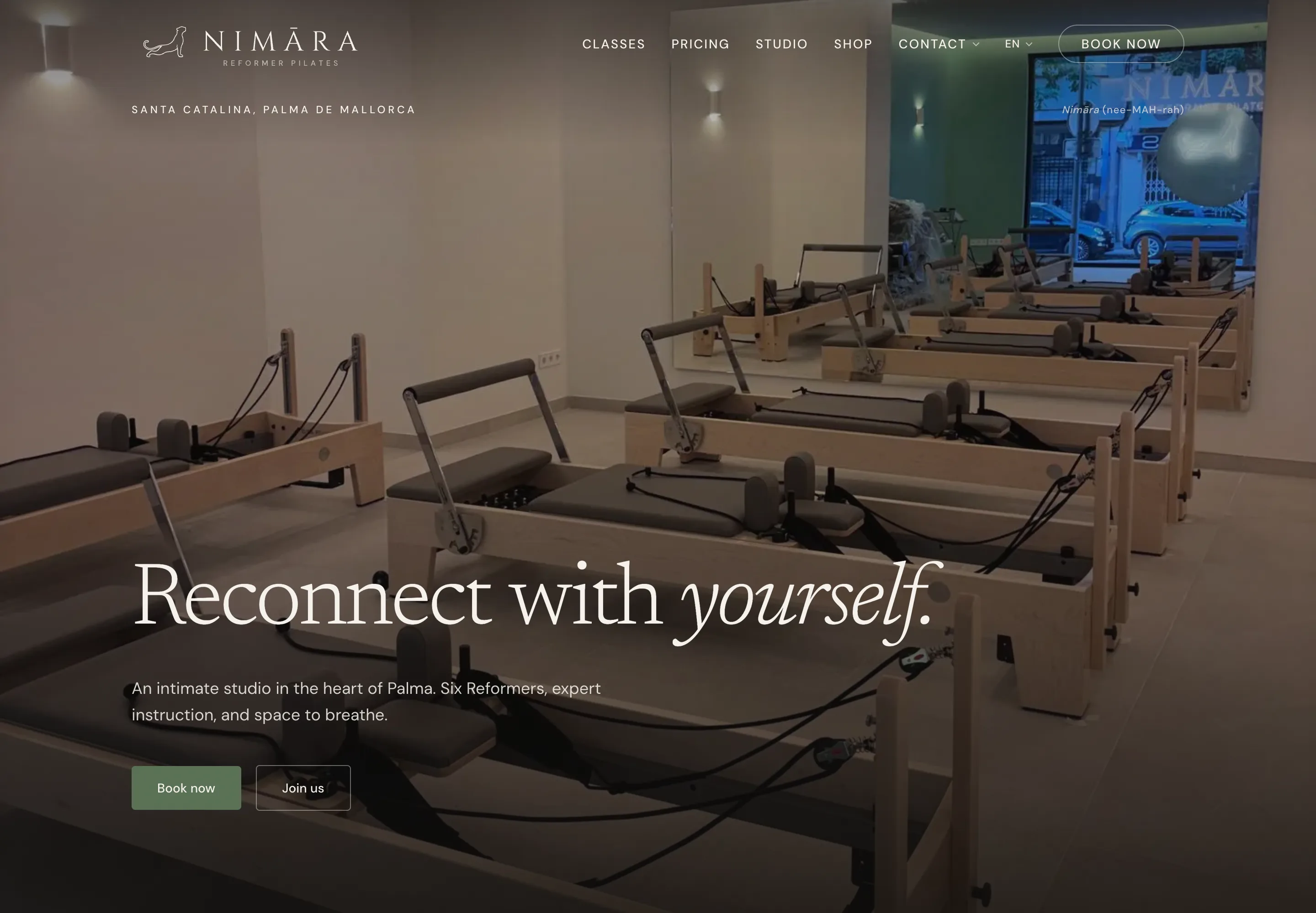
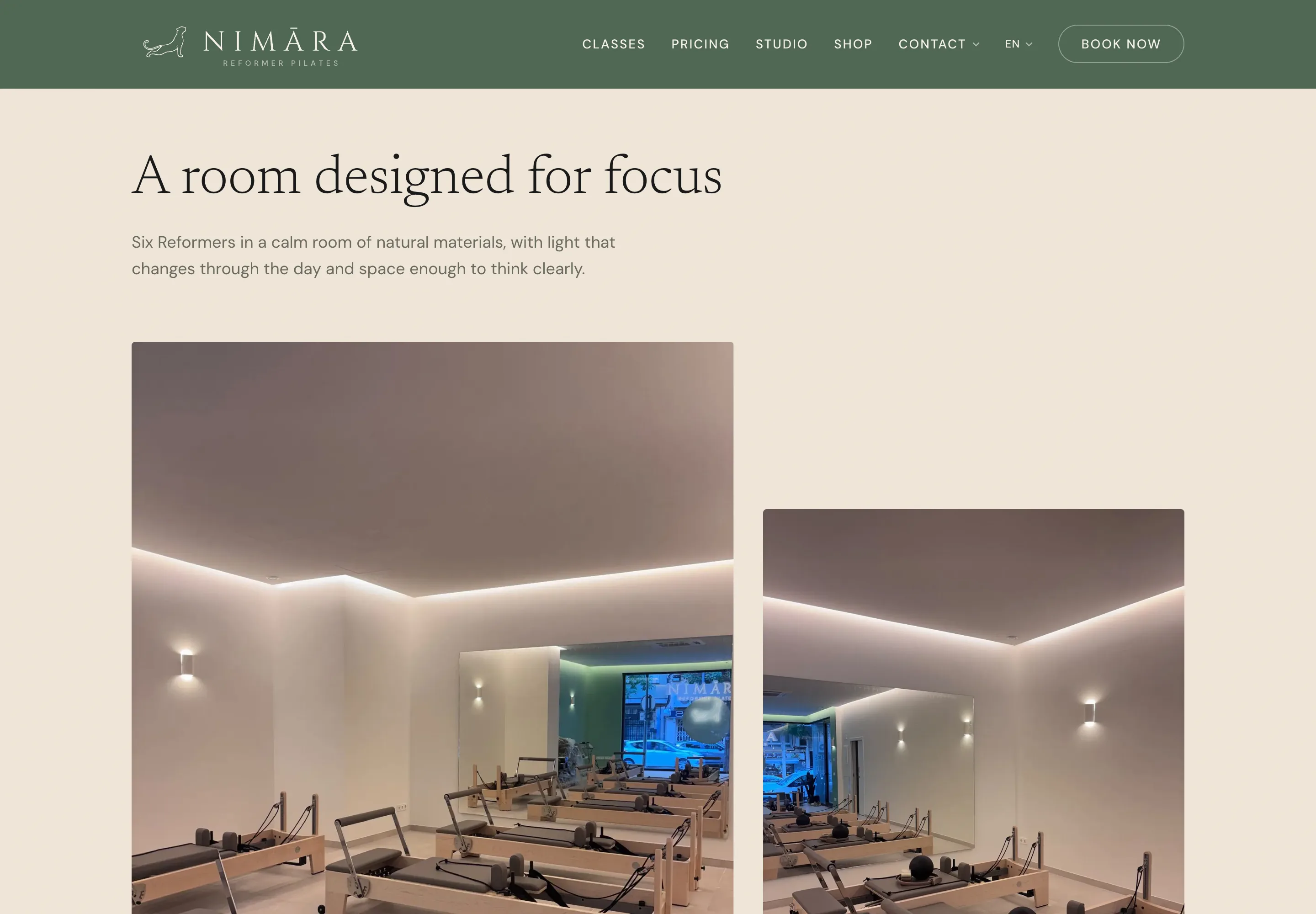
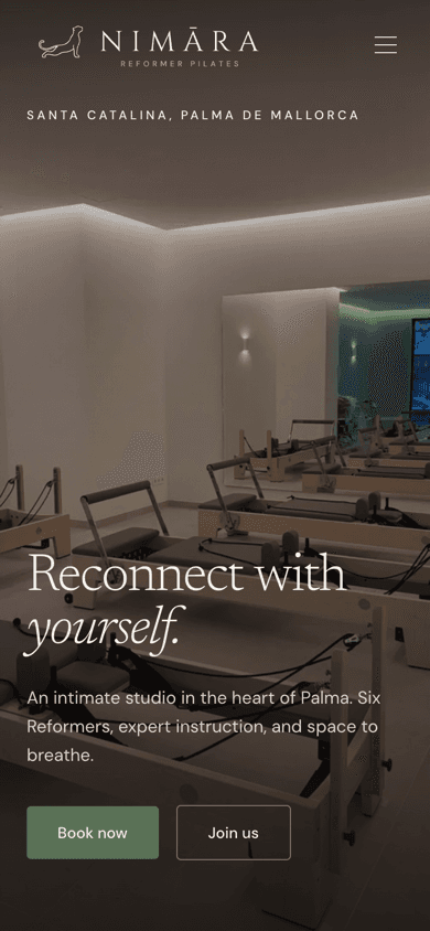
The site is organised like a small publication rather than a booking funnel: classes, pricing, the studio, the instructors, a journal, a shop and the policy pages, all written in the same register. The studio itself is one room in Santa Catalina with six Elina Pilates Elite reformers, and classes are capped at six places for sixty minutes, so the site never has to claim intimacy that the room cannot deliver.
Every string exists in English, Spanish, French and German at full parity, held in a translation layer of 1,864 lines. The language switches in place without a reload, and each visitor's choice is remembered.
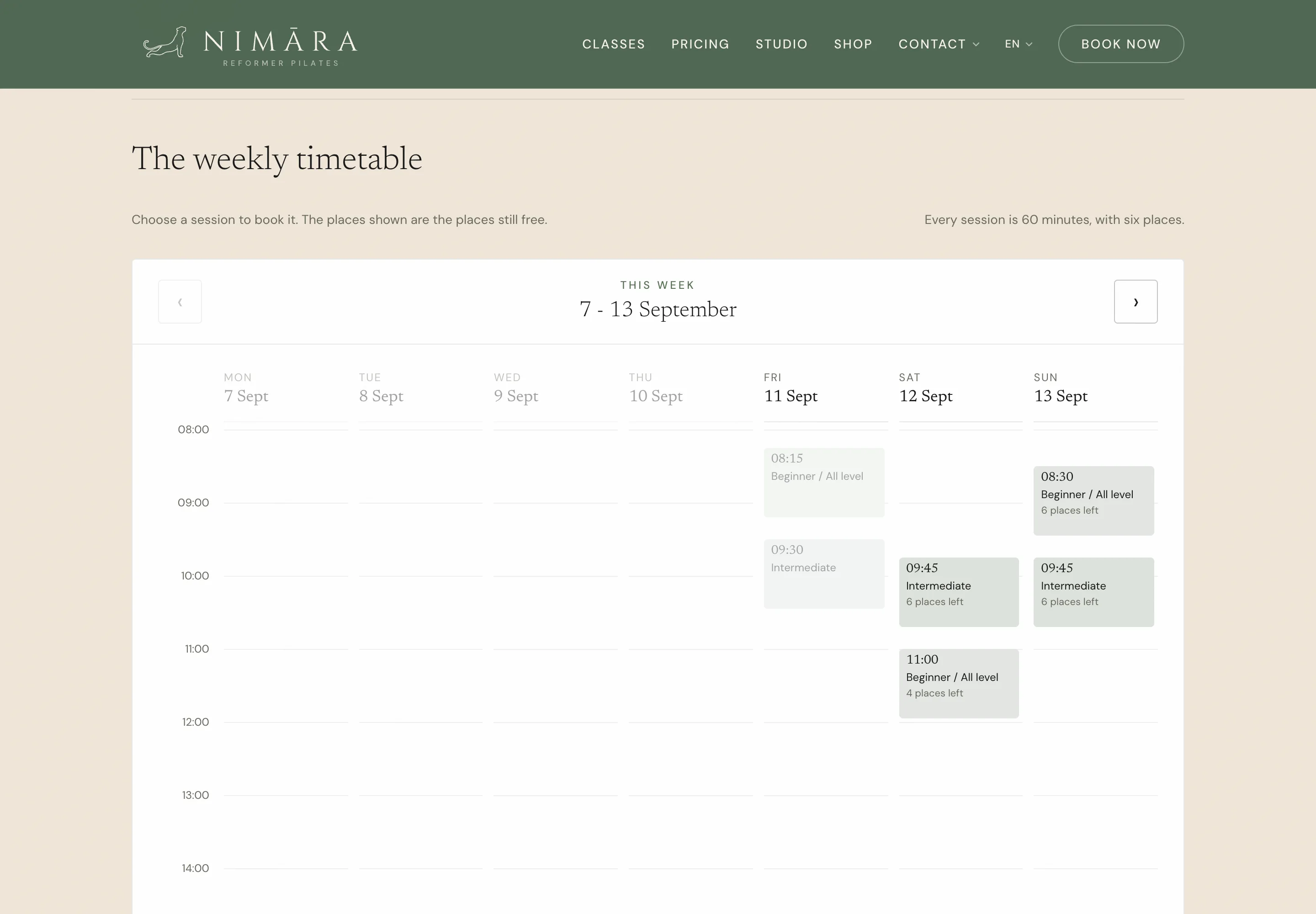
The studio opened on 11 September 2026. The pre-launch wording came off on the day, and the timetable now shows the week ahead with places remaining against each class, read live rather than kept by hand.
Page inventory
- ClassesThe programme, 60 minutes, six places
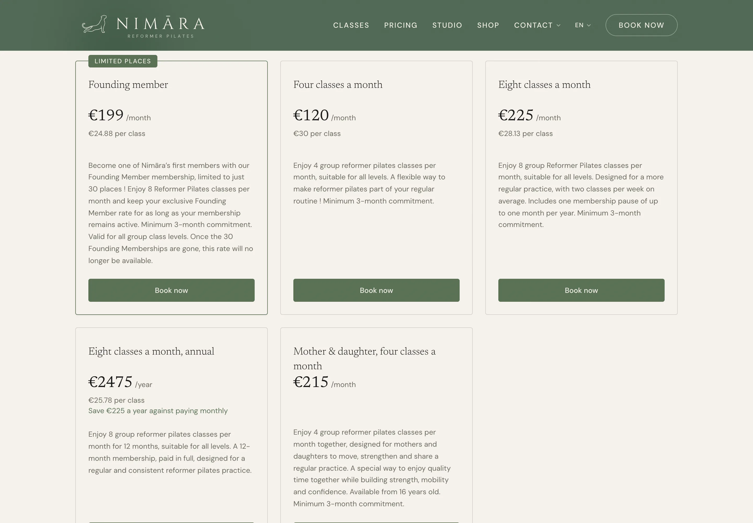
- PricingPacks, memberships and an introductory offer
- StudioThe Santa Catalina room, hours and location
- InstructorsProfiles of the teaching team
- JournalEditorial posts, in all four languages
- ShopRetail, priced from the studio's booking platform
- Careers and partnershipsHiring and partnership enquiries
- Link in bioA standalone destination for Instagram, without the site chrome
- PoliciesCancellation, privacy and terms, in all four languages
The build
Content lives in source-controlled TypeScript rather than a content management system, and that is precisely what makes four language parity enforceable. A missing translation is a type error that fails the build, rather than an English string that quietly appears on the German page and is noticed six months later by a customer.
Content
Typed translation layer
1,868 lines, four languages, parity enforced at build
Journal
Editorial posts, translated
Structured data
Coordinates, hours and the class catalogue
Application
Next.js App Router
Static pages, no CMS
GSAP and Lenis
Reveals and scroll smoothing
Contact and lead capture
Writes into the studio's booking platform
Delivery
Vercel
Hosting and edge delivery
Booking platform
Schedule, retail and checkout links
A primary enquiry channel alongside the form
- •ExerciseGym and LocalBusiness structured data carry the coordinates, opening hours and class catalogue, so map results and AI answers about pilates in Palma have an accurate source.
- •Film grain, vignette and parallax are separate layers applied at render, so the photography stays clean at source and can be reused for print and social.
- •The schedule and retail pages read live from the studio's booking platform, so the site never carries a price the till does not.
- •WhatsApp sits alongside the contact form, because in this market it is the channel people actually use.
What the homepage weighs
- Transferred
- 1.4MB
- Requests
- 61
- DOM nodes
- 298
When it paints
- First contentful paint
- 364ms
- Largest contentful paint
- 364ms
- Load complete
- 487ms
Measured on 25 September 2026 by loading nimarapilates.com/ twice in headless Chrome at 1440 pixels with the cache disabled, and keeping the better run. This is a desktop connection on a fast line, so the paint figures are a floor rather than a field measurement. The transfer weight and request count are the numbers worth comparing, because they do not change with the connection.
Delivery
The asset library runs to 565 files, of which 523 sit in eight numbered folders so that anyone asked for a logo can find the right one without asking a designer which version to use. Every permitted colourway exists as a finished file, which is the practical reason the identity has not drifted since it was locked.
Asset library
- 01 Marks
- 146 files
- 02 Wordmarks
- 64 files
- 03 Lockups, horizontal
- 100 files
- 04 Lockups, vertical
- 104 files
- 05 Favicons
- 12 files
- 06 Social
- 66 files
- 07 Print
- 29 files
- 08 App icon
- 2 files
Print artwork supplied
- Business card
- 85 × 55mm
- Compliment slip
- 210 × 99mm
- Envelope, DL
- 220 × 110mm
- Letterhead
- A4
- Window sticker, domain and QR
- 350 × 70mm
- Window sticker, circular
- 1 metre
- Window sticker, opening overlay
- 860 × 90mm
- Opening flyer
- A5, 3mm bleed
- Discovery flyer
- A5 and A6, 3mm bleed
This is how we work on every project. If it suits what you are building, we should talk.
Talk to Faro